Hey, I like the new themes! If you want some constructive criticism (I know, everyone has some to give), I have a few remarks I hope you find helpful. Basically my complaints are all about the contrast of the text to the background and how it bothers me to read.
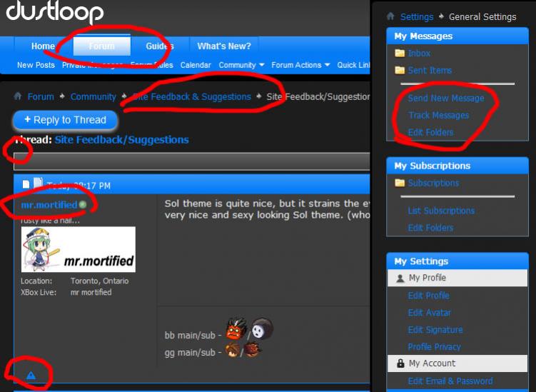
I circled in red things I think can be improved.
(Nitpicky) The selected tab at the top (home, forum, etc) is a little too low contrast.
(Nitpicky) The white border on the grey bar against the dark grey is a bit jarring.
The blue on dark gray is too much contrast for the font size.
However, the same blue on a more mid tone grey is too low contrast to read.
- Imho, that vibrant blue isn't working as a font color. As a disclaimer, I prefer lighter forum backgrounds. The colors are attractive together as a design but not to read on for me.
I really like the Sol one. The sandy colors blend well with each other while remaining distinct, so the contrast the red offers feels purposeful. The only thing on it that I think needs fixing is on the options panes, the red on dark grey background is uncomfortable to read.
Tager is solid. The colors work together and don't conflict. The options panes are a little too low contrast but definitely readable.
- The only real error in any of your designs is found in Tager. The blue exclamation mark on the bottom left of posts shows up, and I don't think you want it there. No blue elsewhere in the design, etc.
I hope this helps. Good work! User interfaces require a lot of work
Is there I way I can hide the image? Don't want to take up a ton of room on this page. Thanks.